Movisie
Art directionUX/UIDone at Henry Handsome
Movisie is the national knowledge institute for a coherent approach to social issues. With practitioners, they develop knowledge about what really works. Movisie’s main role is to accelerate learning processes.

The goals and challenges
- Make Movisie the to-go-to-place for their knowlegde
- Position Movisie as an authority
- More reoccuring visitors and longer time spent per visit
UX from the base
The 3 main personas were defined by Movisie, and with a workshop we defined the key information, to quite an extensive range, as a base for the UX solutions.

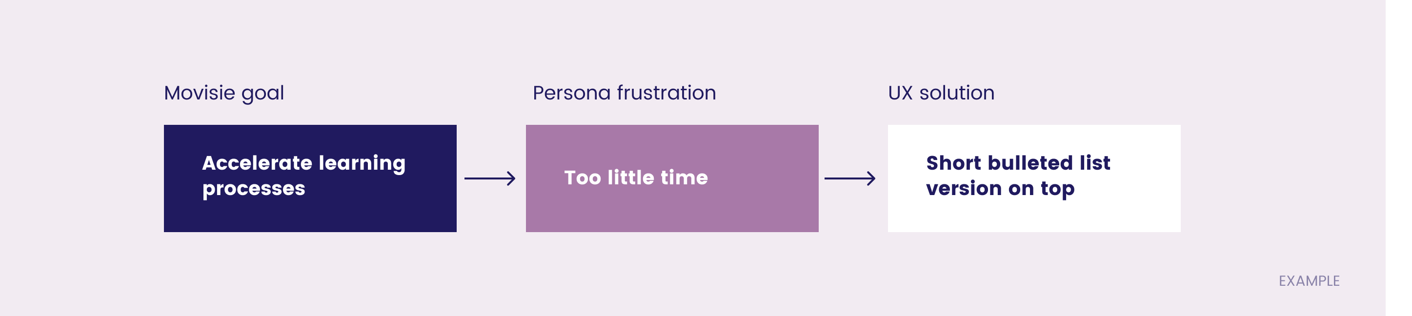
Defining the elements of change
For each persona, I mapped the goals of the project to the needs of the persona, both answered by an UX solution.
4 new main themes
One of the big changers in this project was reducing the theme’s from 50+ to 4 main ones. This strongly helped to give focus to the website content, I did the illustrations for the main themes.

High fidelity wireframes
As the layout played an important part in achieving our goals, we decided to go quite detailed with the wireframes. It ws ideal for further internal presentations.

Small changes add up
By adding different elements to the design, a second layer to the actual content, emphasising the actuality, relevance and building authority.

Style update
Being an active institute of knowledge, the old website looked static and the design was outdated, therefore the feeling of having lost relevance was notable. Moreover, it didn’t convey much authority.


