Art directionUI designDone at Conclusion Digital
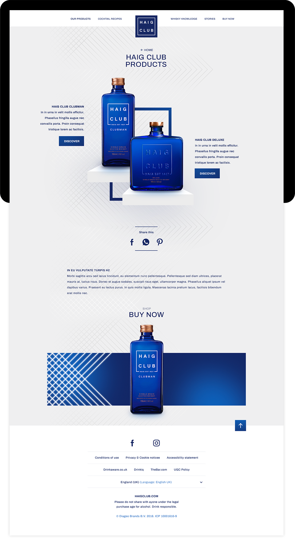
Art direction and UI design for global website of Haig Club. As part of their (digital) rebranding. After winning a prestigious pitch, we made the website parallel to the identity rebrand.

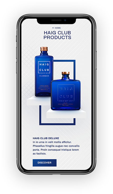
Usually, being a premium brand in the domain of whisky usually comes with a lot of heritage and tradition. Haig Club does it different; Contemporary, modern and premium. With a wink to perfume bottles, the product packaging itself feels like jewelry.

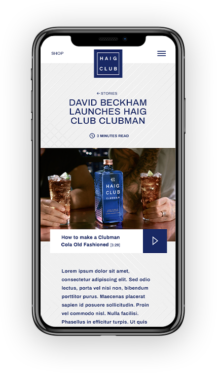
Haig Club is not your traditional whisky brand, it’s positioned as a whisky for cocktails, aimed at a young clubbing audience. By publishing new cocktail recipes weekly, we generated more traffic from social media. Therefore it needed a special visual treatment.

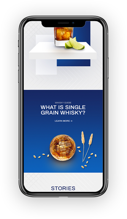
Playing a central role in communication, the cocktails deserved to be presented in a premium fashion. By combining 2d photographs, with parallax and real 3d – we managed to present the cocktails in subtle, yet premium way.
With a library of several background compositions, every cocktail was served with a different one, giving them their own spotlight. It was automated, and combined with the cocktail in the CMS.

Given the young target audience, it was logical to make prioritize mobile devices. The target audience is tech savvy, giving us freedom to work with modern app-kind of interaction standards.

Working smart for faster building. Each component was designed to be reusable throughout the website, making sure every stacking would visually be appealing.

Working with different different international Diageo suppliers, gave us the freedom of a huge library of photography and content.